For any independent artist, it’s obvious that you’ll mostly concentrate on your music. Without good quality music, after all, you are in a tough spot as to how you can progress as an artist!
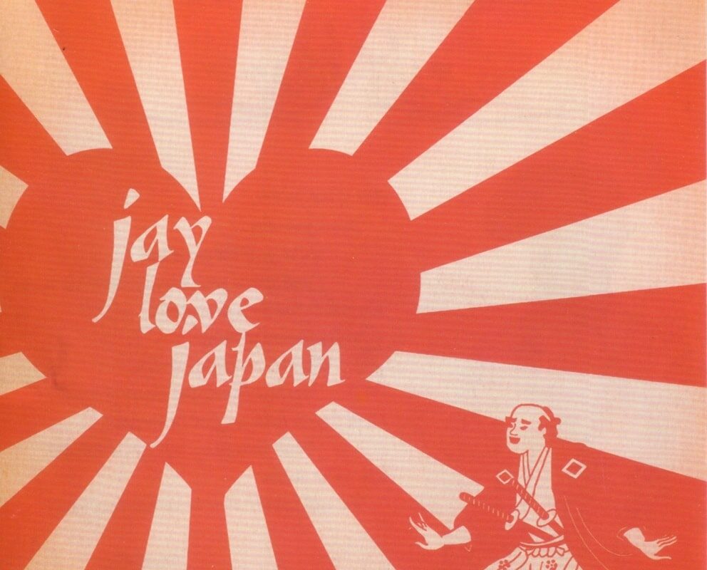
However, one thing that often flies under the radar in terms of promotional importance is the album artwork. What makes a great album cover? What are some common artwork mistakes?
You can have the most fantastic flow and the most logical lyrics, but if nobody finds your album appealing – to stand out from the crowd of albums around it – then how will they ever find out?
A good album cover goes a very long way to making sure that you can stand out from the crowd like never before. It can make a comprehensive change to the way that you work, and often has a transformative effect on the way that you promote yourself.
From the theme of the album to the kind of message that you want to put across, you can make a really significant message with good album artwork. It’s easy to make poor artwork, though. What are some of the most common mistakes made when it comes to producing a high quality album cover then?
Common Album Artwork Mistakes
Low-res images – Anything under 1400 x 1400 pixels, and you are asking for trouble. Make sure that you always take the time to get high quality images to be used on the front of the album.
Unless it’s part of a more abstract image appeal, low-res imagery is only going to make you look like a cheap knock-off artist.
Breaking copyright – The last thing you need to find out is that the abstract shape or scene-setting image that you ‘used’ from Google Images is not actually to be used in the way you intended.
Always take care not to break legal protocol and always make sure you have the right to use a certain image before you slap it on.
Too much – One of the most common mistakes is to try and say too much. Instead of trying to get a little bit of every song in there, why not make sure that the whole experience is instead built around adding less, not more?
Too much can really ruin the appeal and the artistic depth of the album itself. Find one defining theme and point, and built the image on that alone.
Contrast – A big mistake is to add too much contrast without having any meaning. Trying to use colors that clash just to draw eyes to the album is not quite the marketing zinger that you might expect. For that reason, we recommend that you take the time to look closer at the contrast. If it’s too much, tone it down a touch.
Now, you should always try and spend some time looking closer at what more you could do with that artwork. Don’t submit any album covers until you are 100% happy with the representation that it provides and the message it sends out.


